In this tutorial, I will show how to generate bar chats with chemical structures using python and rdkit. I am adopting the code from Andres Berejnoi’s code repository. His code works with any image as long as you can represent the image as numpy array.
For the code, you will need the following python libraries: pandas, Matplotlib, and RDKit. You can install them with either pip or conda.
I am using the following versions in the tutorial. Please note that if you are using a different version, it may or may not work well.
pandas version:  1.1.5
rdkit version:  2020.09.1
matplotlib version:  3.5.3
python version: 3.7.13
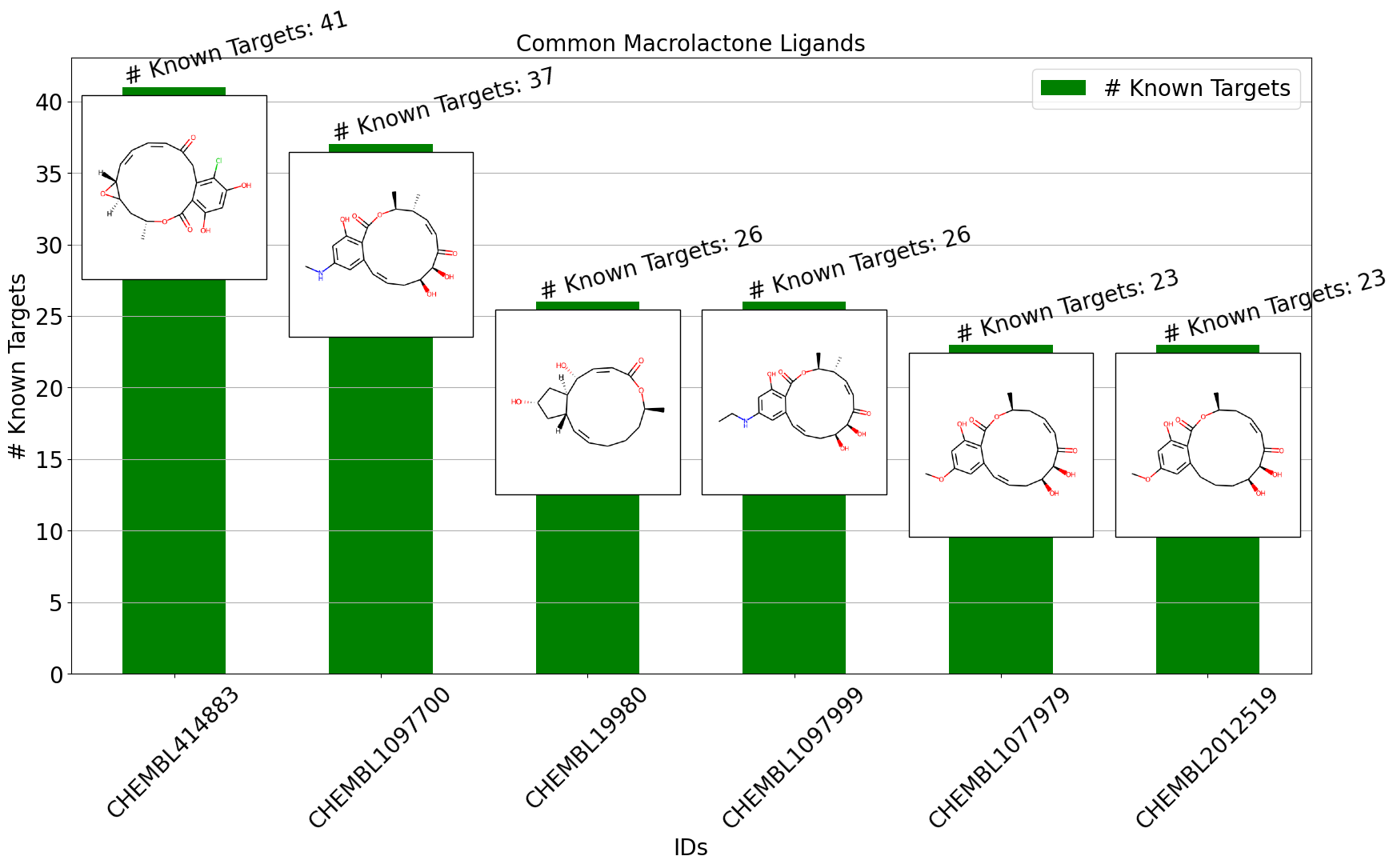
I will be using a portion of data from MacrolactoneDB, which I developed as part of an internship at Collaborations Phamaceuticals Inc. in 2019. In the bar chart demonstration, I will be showing macrolactones with the most known targets, along with the numbers and molecular structures.
The code in this tutorial is available in this github repository. I am using a jupyter notebook for this tutorial.
Let’s get to the code.
We will import the necessary libraries for the tutorial.
We also need to import a custom python file called matplotlib_tools.py. Make sure you have this file in the same directory as your notebook.
import pandas as pd

from rdkit.Chem import PandasTools
from rdkit.Chem import Draw

import matplotlib.pyplot as plt
import matplotlib_tools as mpt
Now, we will load the file containing data.
We are showing chemical structures as images in the bar chart, so it is important to have a column containing SMILEs.
df = pd.read_csv("macrolactone.csv")
df.head(3)

Next, we will add a RDKit molecules column to the pandas dataframe using PandasTools.
PandasTools.AddMoleculeColumnToFrame(df, smilesCol="smiles")
We want to see the molecules with the highest number of known targets, so we will sort the dataframe.
df.sort_values(by=["# Known Targets"], ascending=False, inplace=True)
First, let’s try plotting a basic barchart.
It will look something like that.
plt.bar(df["IDs"][:4],
        df['# Known Targets'][:4],
        color ='maroon',
        width = 0.4)

plt.show()

This is fine, but we also want to see the structures of the molecules in the chart. Showing molecular structures in the bar chart is the point of the tutorial, anyway.
Let’s now subset the data and prep the chemical structures.
We will subset the dataframe to include # Known Targets between 5 and 50. We also need to create a list to contain structural images for that subset.
subset_data=df[(df['# Known Targets']>=5) & (df['# Known Targets']<=50)].sort_values(
    by=["# Known Targets"],ascending=False)[:6]

images_col = [Draw.MolToImage(i) for i in subset_data['ROMol']]
Now, we can do a basic bar plot with some images by calling bar_plot_with_images function.
I am providing only 4 parameters for the functions:
df_to_plot : the dataframe column that we want to plot
img_list: a list containing the images
bartop_labels: the number to show at the top of each bar (in our case: we want to see the # Known Target values)
xtick_labels: a list to show on the X-axis (in our case: we want to see the IDs of the molecules, thus subset_data[“IDs”])
mpt.bar_plot_with_images(df_to_plot = subset_data['# Known Targets'],
                         img_list = images_col,
                         bartop_labels = subset_data['# Known Targets'],
                         xtick_labels=subset_data["IDs"],
)

It looks rather crude. The images are blocking the top of the chart, and the structures are blurry. We also want to write out what the top labels mean. So, we will make some adjustments to improve it.
First, we will set all the font size to 20.
You can adjust each of them separately according to your taste.
plt.rc('font', size=20) #controls default text size
plt.rc('axes', titlesize=20) #fontsize of the title
plt.rc('axes', labelsize=20) #fontsize of the x and y labels
plt.rc('xtick', labelsize=20) #fontsize of the x tick labels
plt.rc('ytick', labelsize=20) #fontsize of the y tick labels
plt.rc('legend', fontsize=20) #fontsize of the legend
We will now plot a nicer looking barplot by adjusting the parameters of the function.
bartop_label_pattern : (string) We can incorporate any text on top of the bar chart using this parameter.
img_scale: (float) we can change the size of the image by adjusting it. The higher the number, the larger the image.
x_offset: (float) you can adjust the x positions of the image relative to the bar using this parameter
y_offset: (float) you can adjust the y positions of the image relative to the bar using this parameter
bartop_label_rotation: (float) you can indicate the angle for the bar top label rotation
You can adjust most parameters the same way you would adjust in matplotlib.pyplot.plot function since the bar_plot_with_images function is wrapping on this, such as the following parameters:
xlabel: (string) label for the x-axis
ylabel: (string) label for the y-axis
color: (string) color of the bars
figsize: (float, float) a tuple containing width and height as floats
rot: (float) rotation of the xtick labels
title: (string) text for the title of the plot
mpt.bar_plot_with_images(df_to_plot = subset_data['# Known Targets'],
                         img_list = images_col,
                         bartop_labels = subset_data['# Known Targets'],
                         xtick_labels=subset_data["IDs"],
                         bartop_label_pattern='# Known Targets',
                         orientation='v',
                         img_scale=0.5,
                         x_offset=0, y_offset=-7,
                         xlabel = "IDs", ylabel = "# Known Targets",
                         color="green", figsize=(20,10), rot=45,
                         title = 'Common Macrolactone Ligands',
                         bartop_label_rotation = 15,
)

I will wrap up this tutorial here for now. Hopefully, you find this post useful. Thank you so much for reading this post.